This was freelance work, where I was asked to create a series of posters for a professional writer. I was asked to highlight to the target audience, if you were struggling writing any sort of professional document using correct grammar that you could contact 'Alex Games' and he would be able to help. We had to follow some guidelines, where we had to include certain information on the posers. His full name, where he would be available, how you can contact him and what time. I created my posters in a style that would reflect the information I was using, for example the posters are about grammar so I played on this aspect.


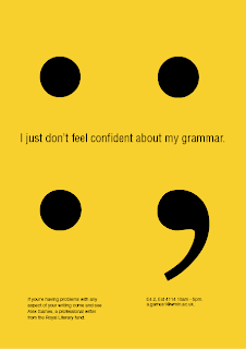
I feel this 3 posters compliment each other and work well as a consistent series of posters. They would stand out to the audience, and they are clear as to what information they are telling.
'The Wizard of Oz book of Play'
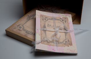
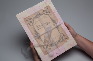
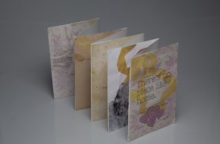
This was a very exciting project to endure. This project was included in my typolinguistics module, whereby we were asked to take an existing written document, and to represent it differently. I decided to choose the Wizard of Oz film script, as I felt the script itself is a main contribution to the film, but plays a small role visually. This document has not been made for the audiences eyes, so I felt this would be an exciting opportunity.
I wanted a hand-made quality to this document, as the film is so personal, I wanted to include this aspect in my document. Firstly I began to think about what parts of the film script I wanted to use as the whole script itself was far too long. So I decided to use parts of the script where the main important characters were introduced. After this stage was over, I started playing with different visual style for me document, bearing in mind I wanted this 'made with love' quality to my piece. My first prototype was an actual hand-made, raw document, using ribbons, old paper and lots of glue. The reason for this was to then see the transfer from this hand-made document to the computer, so I scanned in my prototype and see some exciting visuals. I decided to play with this 'scanned in materials' notion as it did indeed bring a personal quality to my document.
My final response, was to create an document which represented the moral behind the story of the wizard of oz which was a line which stood out from the film 'There's no place like home'. I played on this idea and decided to have my ending about this notion, that we all have good qualities in ourself, but it takes time to discover them. I am pleased with my final outcome and could imagine and mother and daughter sitting down together reading my wizard of oz book.

'Addiction'
My third and final project. This was a very exciting and memorable journey I took which I am pleased about. It is the project I struggled with the most as it was so free to do what I liked. I wanted to pick a subject which really mattered, and was important to me and others. Also a subject which I know nothing about, so therefore I'm learning also. As I brain stormed one subject matter striked me the most, which was addiction. I realised this is a very heavy subject matter with huge psychological information behind it, so I made sure I kept fairly shallow with the matter. As I began to research through my subject matter I realised there was no, yes or no answer to the state of addiction, and why people take this route, this aspect reflected in the amount of information available to the public, so here was my problem I wanted to resolve.
I wanted to highlight to my target audience that addiction is a bad cycle to get involved with, and it's important not to take binge drinking lightly. So I aimed to create a series of posters whereby it's an insight into the world of being addicted to a substance, and the warnings that come with it. The information I decided to represent, was showing to my audience 5 stages of addiction, 1 - 'Justification', 2 - 'Denial', 3 - 'Realisation', 4 - 'Act', 5 - 'Relapse'. Relapse was an important stage to show as this represents the idea of a cycle, going to back to the beginning again. I also had in mind, breaking the boundaries of how we receive information. I thought about how I learnt the best, and I'm a practical learner, whereby I learn by doing and experiencing. This idea of experience, is feeling, so I wanted my audience to experience how it feels to be in an addictive state of mind. My First set of information which I am displaying below, is my set of 5 posters with the information about each stage.
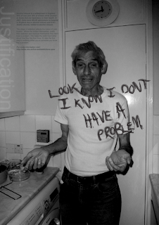
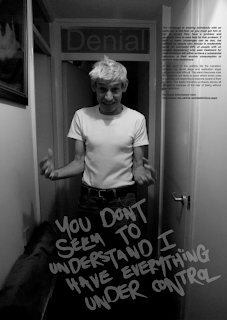
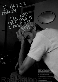
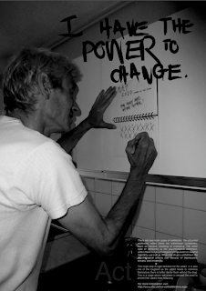
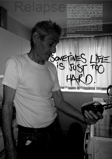
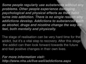
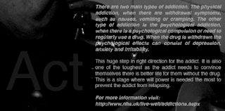
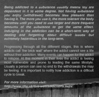
Close up of text. The bold, italic writing is an academic voice from the NHS. The regular text is my own take on each stage.
'Justification'
'Denial'

'Realisation'
'Act'
'Relapse'
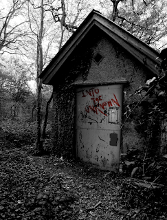
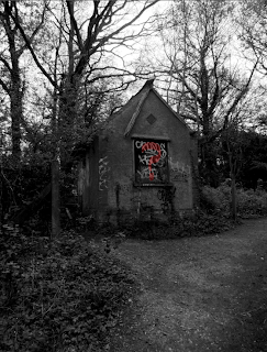
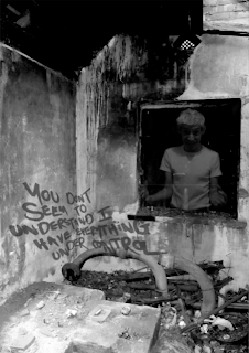
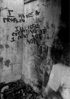
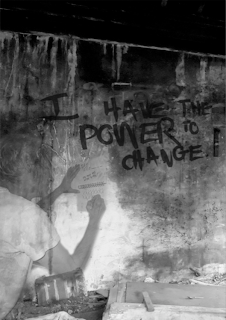
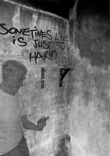
'Experience' In a location where the audience can visit, and experience the information first hand. I wanted the space the audience visited to reflect the addict's state of mind, this is why I picked a derelict building. Experience is learning. Experience is feeling.

My Thoughts.
At the ending of my project and reviewing the design process I endured, I feel pleased with myself, and my work. I feel my finals pieces speak on my levels to my audience, and would be memorable pieces of design. I’m pleased I have had the chance to create my own brief and make my own design choices. I have definitely developed into a better, more efficient design and person. I very much enjoyed the design process I went through, if difficult at times to get to where I am now. This course and module have helped me grow into a person who feels they have gained a great skill, who can really add and make difference in the design world.
Overall, the final outcome to this major project I feel has been successful. My aim was to stand out, make a difference of some sort, and break away from the norm of information design. I definitely feel in terms of information design, it is a radical step but effective none the less. I wanted my work to speak volumes and reach people on an honest and insightful level where they would remember my work, and the story it tells.
